The overall use of a colour is to set a tone, mood, or context.
Colour is usually the first thing we see.
 How would you describe the colours in this painting? Are the colours related in any way?
Words to help you explain Colour:
Bright Dull
Vibrant Subtle
Cold Warm
The colour wheel is simply a guide on how colours relate to one another.
It also helps explain how secondary colours can be made.
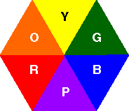
Red, Orange, Yellow, Green, Blue, Purple.
This saying can help you remember the primary and secondary colours =
Richard Of York Gave Battle Poorly
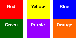
Primary Colours
They cannot be made from any other colour.

Why?
Secondary
If you mix equal amounts of the primary colours, you get the Secondary colours -
Purple, Green and Orange.
Red + Yellow = Orange
Yellow + Blue = Green
Blue + Red = Purple (violet)

What do you notice about these colours together?
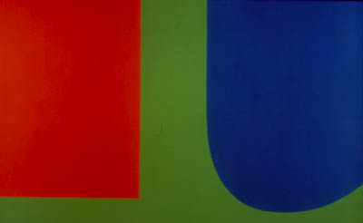 Ellsworth Kelly - Red Blue Green - 1963 -
When a pair of high intensity complements are placed side by side, they seem to vibrate and draw attention
to the element Not all colour schemes, based on complementary colours are loud and demanding
- if the hues are of low-intensity the contrast is not too harsh.
Intensity can only be altered by mixing a colour with its complement, which has the effect of
visually neutralizing the colour. Changing the values of the hues, adding black or white, will soften the effect.
 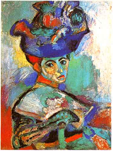 Henri Matisse - Woman with the Hat, Paris - 1904-5 -
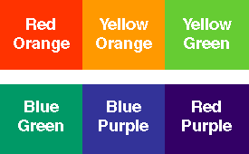
Intermediate
Colours are created by mixing a primary and a secondary: Red-orange, yellow-orange,
yellow-green, blue-green,
blue-purple, and red-purple.
 Henri Matisse - Le bonheur de vivre (The Joy of Life) - 1905-06 - |
Colours at the Juinor School:
I'm off to the Juinor school on Friday to teach the students a few basic ideas about colour. Here are the resources I'm planning to use:

Subscribe to:
Post Comments (Atom)
No comments:
Post a Comment